pompidou centre

Visiting France I had a list “must visit places in Paris”, and guess what was the first place to visit? Nope not Eiffel tower, the first place in my list was Pompidou Centre (museum). After a long trip and short sleep I headed to Pompidou. You either love or hate the exterior of this building is certainly is unique. Most Parisians have warmed to the industrial, Lego-like exterior that caused a scandal when it opened in 1977. The architects’ claim to fame was putting the building’s guts on the outside and “color-coding” them: water pipes are green, air ducts are blue, electrics are yellow, and things like elevators and escalators are red. Art from the 20th century to the present day is what you can find inside.

centre-pompidou

Modern Art Museum, entrance on Level 4 occupies the top two levels. Level 5 is devoted to modern art from 1905 to 1960, including major works by Matisse, Modigliani, Marcel Duchamp, and Picasso. Level 4 is dedicated to contemporary art from the ’60s on, including video installations. Children’s Gallery on the mezzanine level has interactive exhibits designed to keep the kids busy.

As i was travelling not alone, unfortunately I had limited time to be in museum, but any way i knew where I need to go. My aim was to visit exhibition called “KOLLEKTSIA! CONTEMPORARY ART IN THE URSS AND RUSSIA 1950–2000. A MAJOR DONATION” A collection of Russian art of the second half of the 20th century.

What i liked most in this exhibition is how Dmitri Prigov manipulate typography, for instance column of words which is in the middle starting to break, or in massive text somewhere between lines there is hidden word, sentence or even a message. And it really exciting and interesting to search them, theres is always something in he’s typographic poster, it’s kind of playing crossword.  Also there was paradoxical poster which caught my eye, written in red colour in the middle “ВЫХОДА НЕТ” ( NO EXIT )  and on a sides in star wars style like text is stretching in blue colour “ВЫХОД”  ( EXIT ).  Effect is just mind blowing, because all he’s uses is just letters and spacing, it’s just “WOW”

IMG_2337

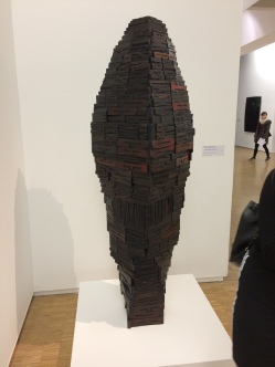
And there was other piece which have attracted my attention Paul-Armand Gette’s sculpture made of letters, and not just letters but letters from letter press, they are wooden I’ve checked them! I have to say It’s quite big and heavy installation in all meanings, it’s like telling us that words they can be big and heavy, and the do mean something.

Unfortunately my trip ended there and I had to go, but I will definitely come back to explore whole museum and its beauties, because what I have seen so far was amazing.

Nicholas Roerich, Riga exhibition.

Recently I’ve been visiting my relatives in Riga, and being at home i could not, not to visit local exhibitions. So this time in my favorite museum “Mākslas muzejs RĪGAS BIRŽA” there was exhibition of Nicholas Roerich paintings, and I was over excited, I couldn’t wait to go there. I’ve heard of Roerich along time ago from my friend, he told me a lot about him, how good he is, how strong he’s paintings and so on. Nicholas was a painter, writer and philosopher, explorer born in Russia but spent half of he’s life in India, you can se it by he’s paintings.

When we went to the exhibition and saw he’s painting, we were amazed, the experience  was unforgettable, he’s painting truly are stunning, rich of vivid colours, textures, beauty, vibrance and emotions. On the first look he’s paintings looks simple and a bit abstractive, but as soon as you take a deep look in then you will understand and feel how live they are. For instance he’s painting could deliver you a filling that you are standing at the same place or spot where Roerich painted them, It’s like if you take a picture of nice view with good camera but it won’t be the same as your eyes see. But Roerich could deliver this view with he’s painting. Definitely it is  he’s ability to meld colours, shapes and shades together to create harmonious painting.  You can see it by he’s vibrant and vivid works. When you are  looking at he’s paintings you can feel like he’s expressing he’s mood and philosophy through he’s painting, and I must say it is stunning. You can not compare or equate Roerich with Picasso, Rembrandt or with classic, modern style of painting,  it won’t work! because he created he’s own style of painting! He was more then just a painter he was an artist. I appreciate that we had opportunity to witness he’s works, hope to see them again!


FOOD stop-motion by Michaela Mihalyiová

Slovakia-born animator Michaela Mihalyiová has created Food, a stop-motion animation that interprets meal times through a handful of sweet visual jokes, connected by one character. Inspired by cut-out illustrations Michaela wanted to add movement to the style and spent about a week hand-making the puppets and sets.

“The actual shooting of the film happened in a school atelier in Prague and it took all of the Harry Potter audiobooks, around 25 New Yorker podcasts and a few TED talk recordings to get it finished, all in all it was about two weeks,” says Michaela who’s currently studying animation at FAMU in Prague.

The idea came to Michaela while she was having coffee and imagined a naked person taking a bath in her espresso. The film is simple and well-executed.

Michaela Mihalyiová: Food (still)

Animation

Making of animation


who is Jamie Hewlett?

Everybody knows Gorillaz and their animated music videos, right? And I guess you questioned your self “who are this guys?” Well they are fictional characters, created by Jamie Hewlett, and there is only one person in this band and it is Damon Albarn. So Hewlett is responsible for character design and Albran for music.

View this post on Instagram

Smoking in Chicago

A post shared by hewll (@hewll) on

Brought up in Horsham, West Sussex, Jamie Hewlett was a pupil at Tanbridge House School, a local co-educational comprehensive for pupils aged 11–16 years. He contributed to the art work of a road safety campaign that ended up runner-up in a national television competition. While studying at Northbrook College Worthing, Hewlett, Alan Martin and fellow student Philip Bond had created a fanzine called Atomtan. This brought him to the attention of Brett Ewins. After leaving college Hewlett and Martin were invited by Ewins to create material for a new magazine he was setting up with Steve Dillon in 1988. The magazine was called Deadline and featured a mixture of comic strips produced by British creators, and articles on music and culture.

In 1988 Jamie Hewlett created comic book Tank Girl. Based on this comic book in 1995 was released film, but it was criticised by fans who said it failed! But it’s not Hewlett fault, Hewlett had very little involvement with the film. So characters from Gorillaz has similarity from Tank Girl comic book basically same style.

I love all of their music videos, they are full of colours, humour, and unique style, especially Dare music video. Simple, interesting and creative, Noodles dancing in hers room and singing with gaint head, and while they are singing entire room begins to light up with the music. Simple animations, minimum actions, but look very effective, because the only animation what is moving basically is Noodles, and the rest is just like a side effects, like lights, smoke, background which is always almost the same, and camera spins around. Everything genius is simple!

Hewlett instagram is filled with his works, illustrations, animations and digital work, have to admit interesting page, must have to follow! Definitely what he is posting is expressing him, and the way he experimenting with different styles, themes, colours, only proves how creative this person is.

View this post on Instagram

Animating with my animation brother Robert_valley.

A post shared by hewll (@hewll) on

View this post on Instagram

Making video!!!

A post shared by hewll (@hewll) on

View this post on Instagram

Slap shot

A post shared by hewll (@hewll) on

View this post on Instagram

Don't like Royal babies?

A post shared by hewll (@hewll) on

Ninian Doff

3765481844_e1fd575c12_bI was following this guy for sometime, and god he is good! Hi’s doing music videos, and they are special, there is something that none of the others has. Ninian has motion graphic background, he used to be motion graphic editor in advertising agency, and in 2016 he was awarded as best director at UKMVA’s.

Each of his video is unique, maybe because every time his doing a video he is having a fun!

First video which I saw was “Staring Out The Window” – Fulton Lights” and my reaction was: I just started to laugh like insane and I said to my self: ohh boi its GENIUS and funny at the same time.

So basically the whole video is black and white, crows running around the park, singing, dancing, playing musical instrument with the human hands! Must see it!

And second video was “Migos – One Time” and it was something totally different and fresh. And every time when Im watching this video, Im asking my self, how this guy is doing it? Its amazing! Every work is inspiring, and there is nothing impossible.

His style is unique, his not afraid to experiment, try out something new and his doing it with confidence.

Definitely his motion graphic skills helped him a lot, and the way he uses his imagination is insane. But what interesting his editing and composing all videos by him self! No doubt he is enthusiast and  passionate about what his doing, thats what i like in him!

Milky and Nick Goldsmith

440px-2008-0419-NickGoldsmith

Nick Goldsmith is a British music video producer and film director. He started as a music video director, and did many popular music videos for Fat Boy Slim, Blur and others. Later he became film director and produced: Sons of Rambow  and The Hitchhiker’s Guide to the Galaxy.  Have to admit hi’s cool director! And hi’s  work proves this, I enjoyed watching hi’s movies, but Im enjoying watch hi’s music videos more!

One of my favorite works is music video for Blur band, about milk carton, which is searching for lead singer of band who appeared as a missing persons face on its side. Being on a street milky facing lots of horrible things, like people kicks tin’s, stomp other milk carton and being rood to him! But hi’s not giving up and continuing his search.

The idea was so simple, strong and genius, video even won several awards in 1999 and in 2002 video was voted as a 4th best video of all time by VH1. I really like the way it was shot and how this little milk model looked like. The way he moved, his facial expressions and animations overall are brilliant.  Hope to see more videos like this from him. This inspires me to try something similar and i’ll definitely try.

Milkcarton

Pokras Lampas

Pokras Lampas – is modern Russina “calligraffiti” artist. He combines work on different design projects with many exhibitions and perfomances, as well as workshops and street-art festivals. He creates big scale calligraphic compositions within an urban environment and interior, and he’s always trying to experiment with forms and volumes of the typography. He’s first language is Russian and he is  working with Cyrillic and Latin letters. What makes he’s style and calligraphy unique is that he studied Korean calligraphy and have investigated Japanese, Chinese, Greek and Arabic ­letters a lot, to turn Cyrillic letter shapes into new forms. He’s style reminds me of Niels Shoe Meulman’s  same volumes, shapes, I recon he was inspired by him. With a graphic design background he became successful artist. Today he is quite famous, he works with brands such as Nike, Mercedes-Benz, and FENDI. And there is no wonders that he achieved success, he’s calligraphic skills are amazing, he’s works is fool of energy, confidence and they reflect he’s passion, he definitely love what he does. When he’s drawing he’s lines are not perfect and what most interesting is that nothing is symmetric, lots of spray splashes or drips in he’s works, may be that’s why he’s works are so beautiful. It took him 5 years to master he’s calligraphic skills. And as every other artist he’s not afraid to try and experiment, he drew on females body’s, walls, roofs constantly trying new ways to draw, inspiring person.

Pokras Lampas Instagram

https://www.instagram.com/pokraslampas/?hl=en